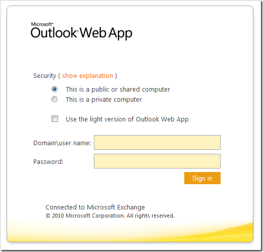
We are in the process of migrating our mail server from Exchange 2003 to Exchange 2010 in our organization, and one of the first things I noticed on Exchange 2010 is the new design in Outlook Web Access. its much simpler, and in my opinion much cooler:
though the yellowish color on the default theme kind of get on your face, it can easily be changed to another color scheme you like. besides the redesign change, I like Microsoft integrating full support for other browsers besides Internet Explorer like in previous Exchange releases. this is helpful for people using Macs, or people using different browsers like Firefox.
there are a few new features in OWA 2010, which I plan to write about once I get acquainted with them, for now I just wanted to write a few lines about OWA 2010 new design. I love simple designs, and I think Microsoft hit the nail on the head with me with OWA 2010.
Was this article helpful?
Your feedback helps us improve our content.
0 people found this helpful!


